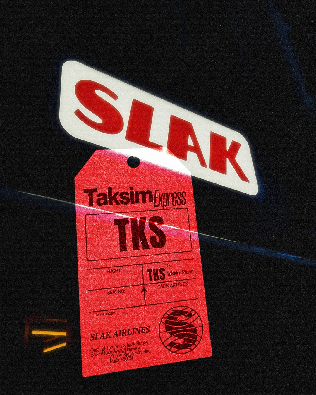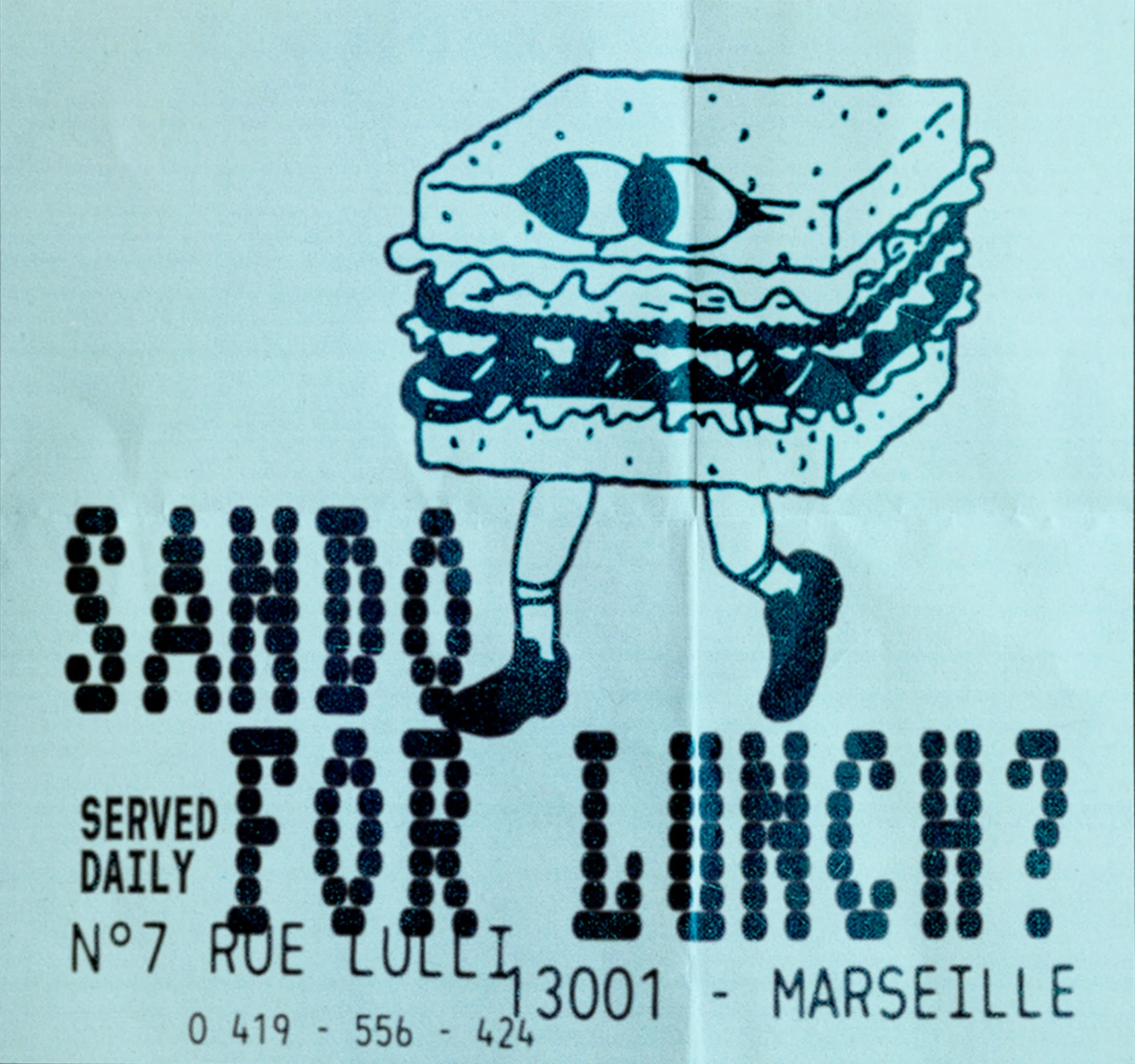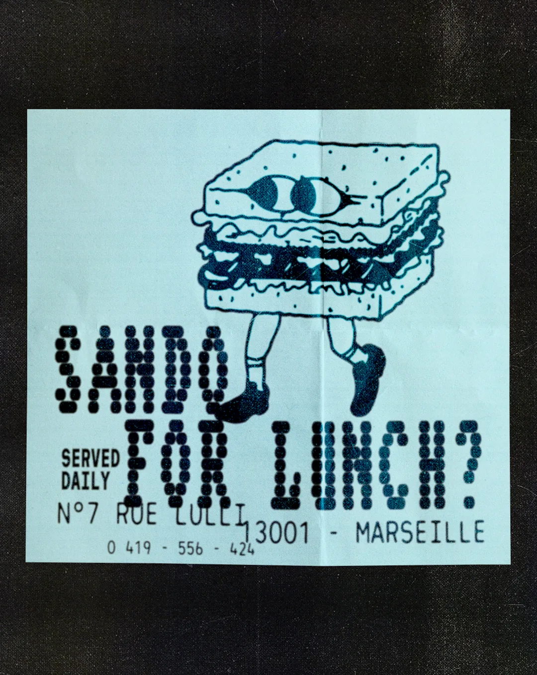
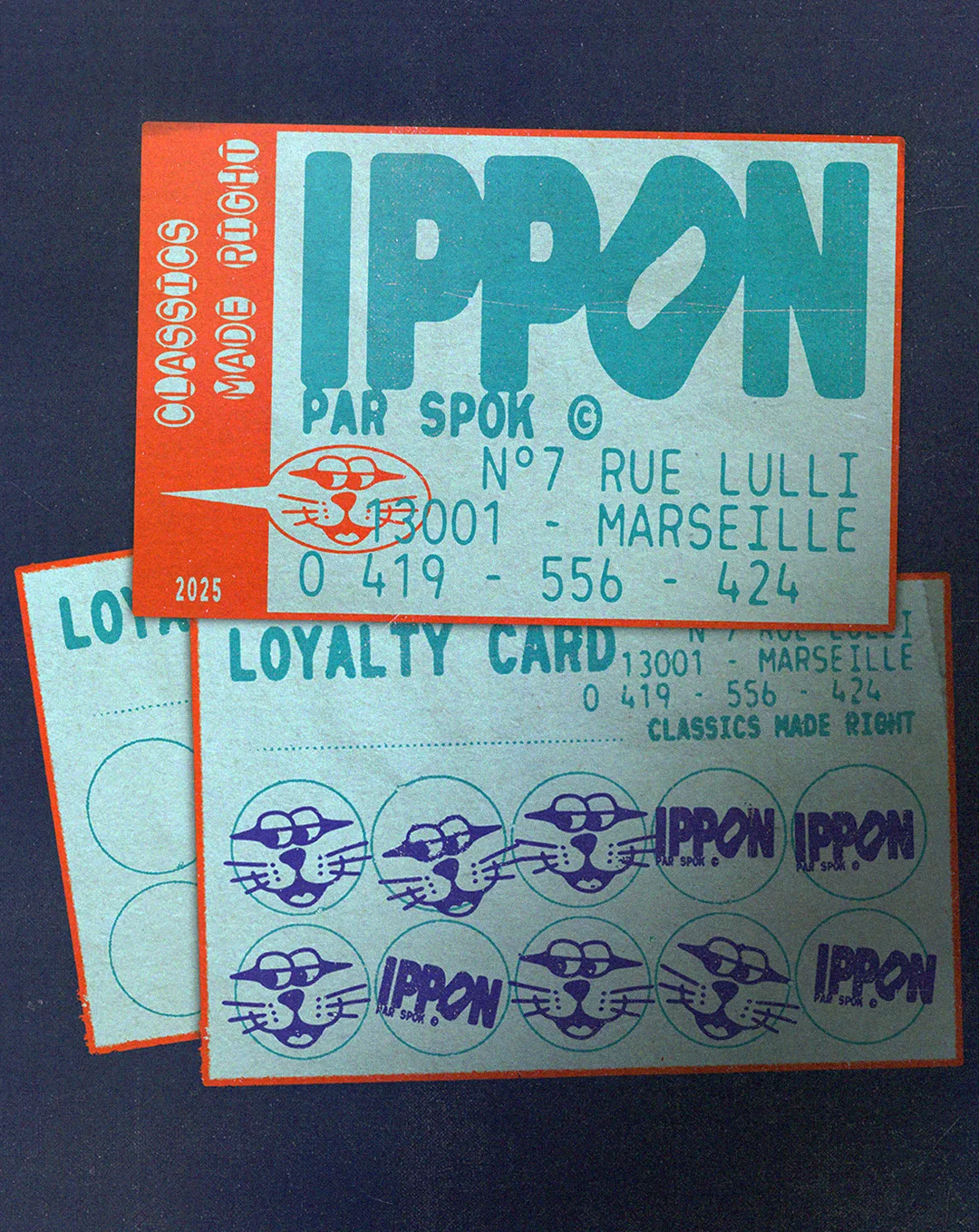
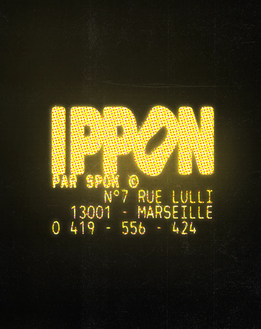
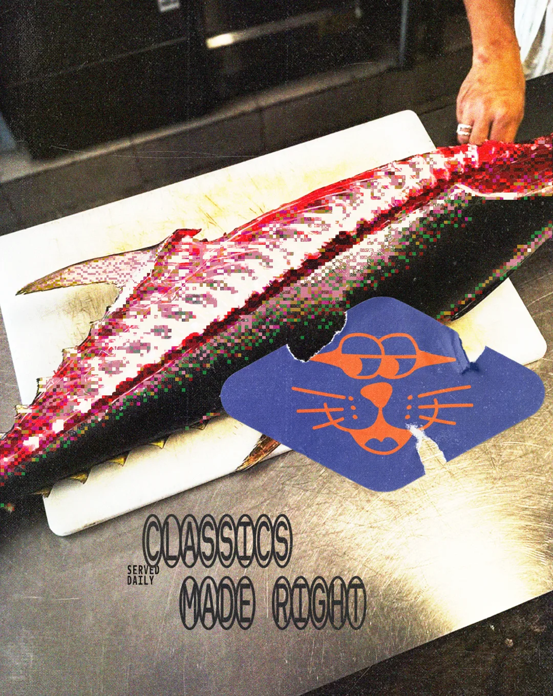
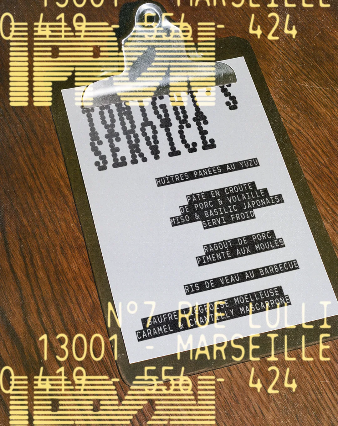
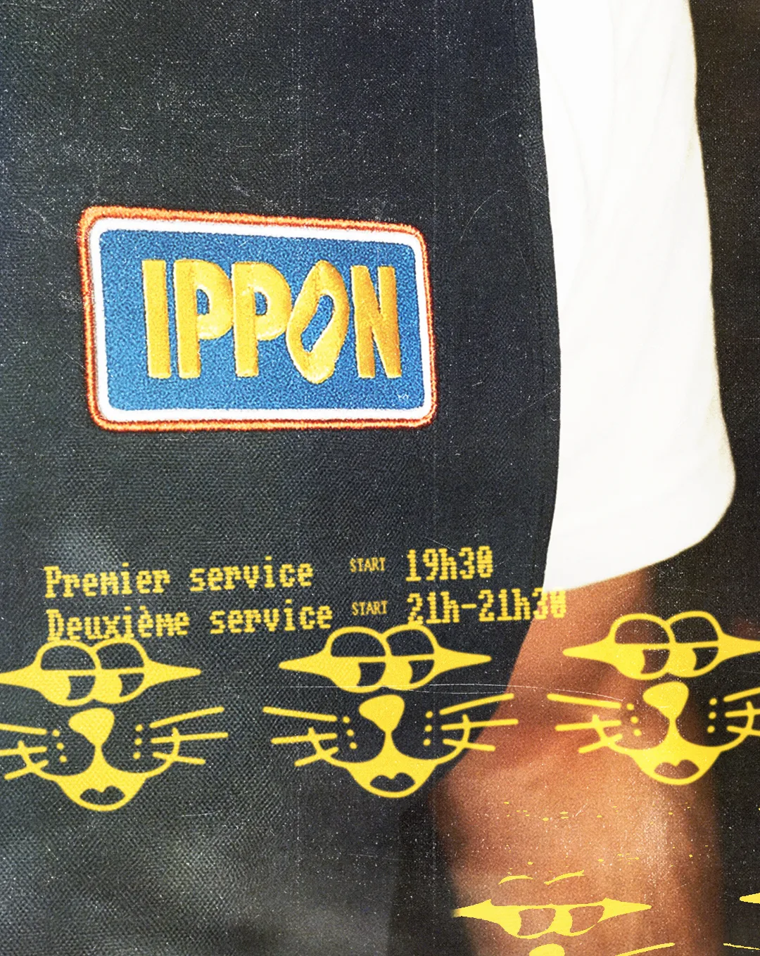
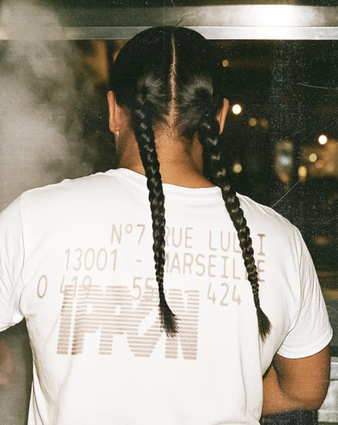
It opened as a Japanese canteen and has since moved toward a freer, more personal kind of cooking, with a menu that keeps changing. The identity is built to keep up. The wordmark is fat and rounded, with a slash cut through the O, and it never shows up the same way twice: lit in yellow dots like an old LED display, sliced into stripes, stitched onto an apron patch. All the type around it looks like it came out of a receipt printer: the address, the phone number, tonight’s service clipped to a board.Then come the characters, drawn by hand. A cat with whiskers and wraparound eyes stamps the loyalty card and runs across the aprons. A sandwich on legs asks if you want a sando for lunch. The line that holds it all together is Classics Made Right.